Mobile Decision Support
General Dynamics (2013–2014)
Project goals
This project involved re-imagining an extensive desktop application called Command Post of the Future (CPOF), as a smaller-scale Android tablet application for a subset of users.
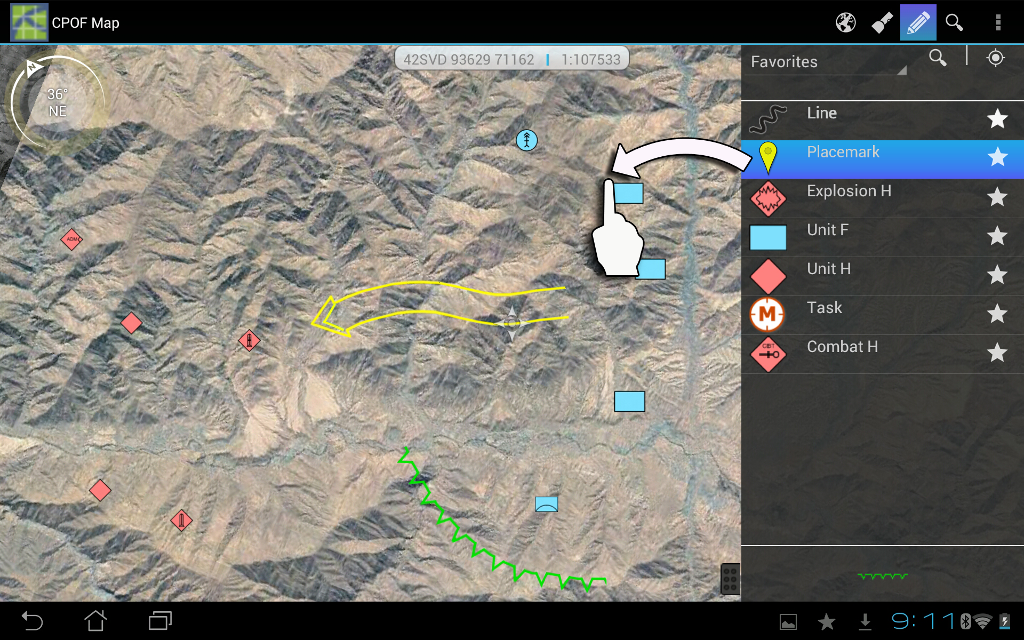
CPOF is such a large and complex application that the desktop version is often used with three monitors at once. While that size of a display is not a match for mobile use, there are features that users who travel between bases (such as higher-ranking individuals and their assistants) would love to have. They want to keep up to date on developing situations and make updates as they gather information. Our tablet application includes a targeted subset of functionality such as a live map and graphic annotation that supports these needs.
Contributions
- Subject-matter expert interviews
- Paper prototype creation and testing using the RITE method
- Touch-based interaction patterns
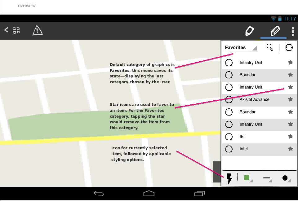
- Wireframes for the graphics and drawing features
- Usability testing with the final live prototype
Results
At the end of the project, it was presented to clients in the U.S. Army and was enthusiastically received. We conducted a final round of usability testing with the completed live prototype and users were able to easily complete key tasks that we had agreed upon.
Process
Working within a small team, we moved from upfront research to a working prototype over the course of a few months. We explored and tested different interaction patterns and were able to bring in entirely new features and interactions, taking advantage of the tablet's camera, GPS, and touch input.
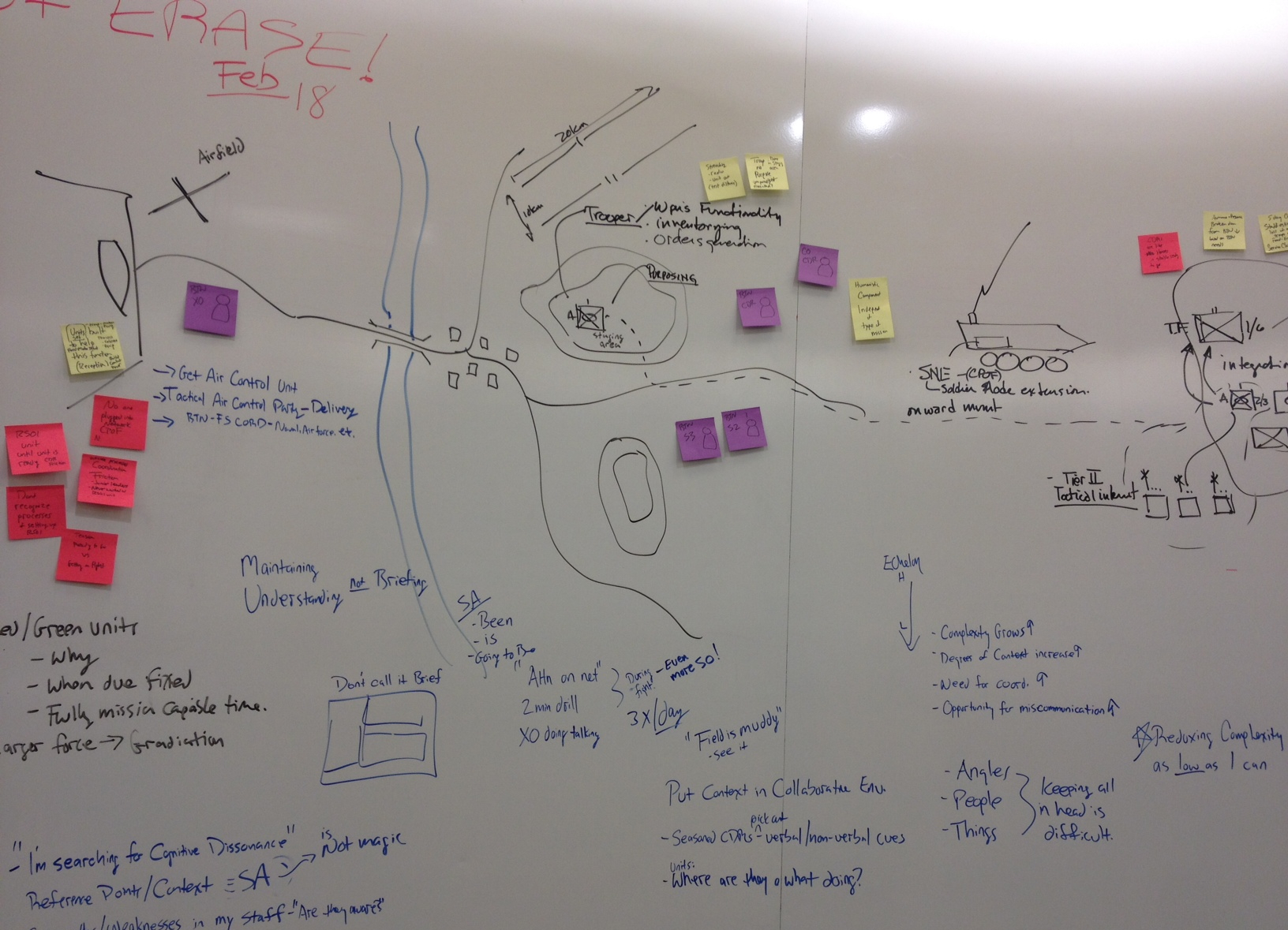
Over the course of the project, there were primarily two designers, including myself. We interviewed subject matter experts about their daily work life to find out how the mobile app might be used. We learned that commanders travel between bases with assistants who might also use the application, and that in addition to interacting with the map view, participating in briefings (presentations) was also key.
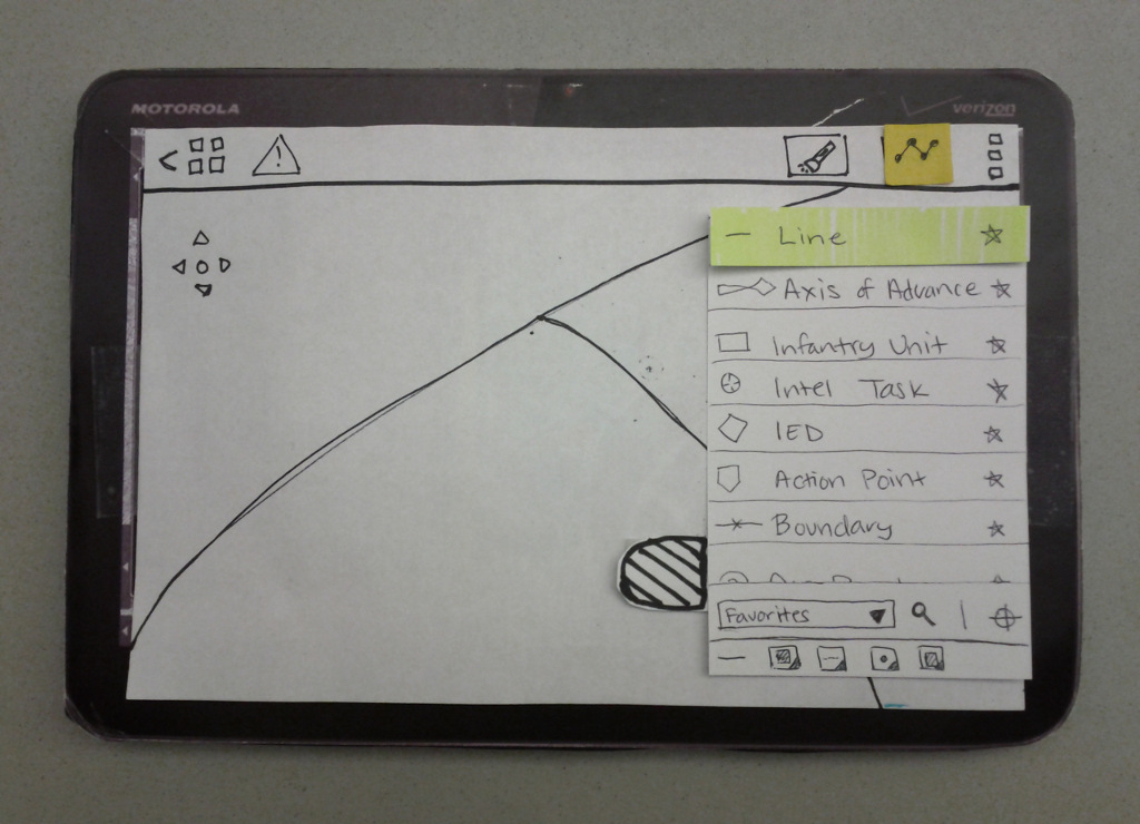
We did several rounds of think-aloud usability testing, both with paper prototypes and with our live prototype. For the paper prototype, we used the Rapid Iterative Testing and Evaluation (RITE) method, meaning that we modified the prototype as problems and their solutions became clear through testing.
Because we used a paper prototype, it was relatively quick and easy to try out different interaction patterns, visual cues, and wording. We mounted the prototype on foamcore of an appropriate size to better simulate a tablet experience.
While working with paper prototypes, I was also reviewing standard Android interaction guidelines and exploring how they might fit into our particular application. I created documentation of how each gesture would be interpreted in our application. This documentation was revised as any changes evolved during usability testing and team feedback sessions.
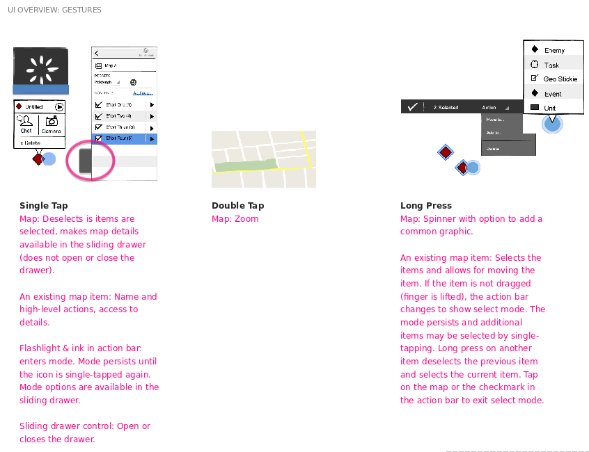
Once the results from usability testing were consistently good and the design and development team were satisfied with the design, I created documentation to capture our decisions.
Development was occurring in tandem with design throughout this prototype project, but final specifications helped us to make sure that we agreed on the details and that the implementation matched our collective intentions. I was able to work closely with developers both in person and remotely throughout the process, which facilitated experimentation with the UI behavior and style.
